Some links on this page are affiliate links. This means we may earn a commission at no additional cost to you if you click through and make a purchase. Thank you for your support!
Patterns can make any space more interesting and eye-catching. Stripes, checks, and florals are three classic patterns that can refresh your home. They work well with many interior styles, from traditional to modern. But how can you use these patterns to make your home look better?
Are you ready to learn how to mix patterns in your home? We’ll show you how to blend stripes, checks, and florals into stunning interiors. Get ready to see how these timeless motifs can reflect your unique style.
Understanding the Power of Pattern in Interior Design
Choosing patterns in interior design is a complex art. It can greatly change a room’s feel. Knowing how patterns work can make any room look better.
The Psychology Behind Pattern Selection
People have different tastes in patterns. Some like simple patterns for calm, while others enjoy bold ones. Patterns can make us feel certain ways and change how we see a room.
Creating Visual Interest Through Pattern
Using different patterns can make a room interesting. Florals, geometric designs, and stripes can be mixed for a cool look. The trick is to make sure they all work well together.
Balance and Harmony in Pattern Usage
It’s important to balance patterns for a good design. Think about the room’s color, purpose, and what’s around it. Mixing patterned and plain areas can make a space look great.
“Mixing different types, scales, and shades of pattern is recommended in interior design. Start with a common color thread to tie patterns together, aiding in balance and cohesion.”
Knowing how patterns work can help designers and homeowners. They can make spaces that look good and feel right. Whether it’s simple or full of patterns, the right use of florals, patterns, prints, textiles, and fashion trends can show off personal style.
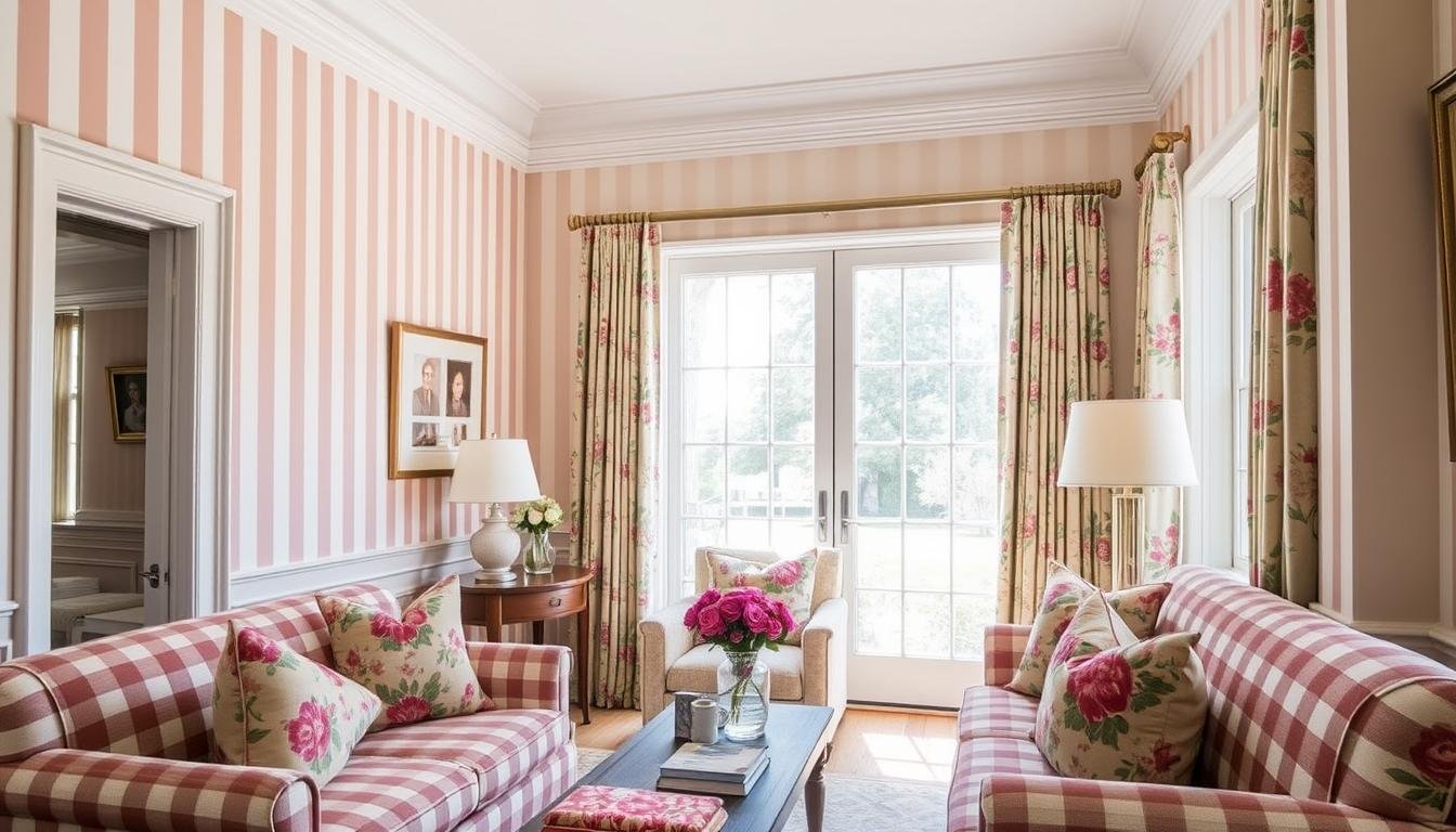
Stripes, Checks, and Florals: The Classic Pattern Trio
Stripes, checks, and florals are key in apparel design, garment styling, and textile manufacturing. They’ve also become popular in interior design. They bring timeless charm and visual interest to homes.
Stripes can add order and structure to a room. They’re versatile and can be used in many ways. For example, vertical stripes can make a room feel taller, while horizontal stripes can create a calming effect.
Checks and plaids remind us of cozy country cottages and woolen blankets. They can be sophisticated or casual, depending on the design and colors. They add rustic charm or sophistication to a room.
Florals, a favorite in British interior design, add a delicate touch to any space. They come in various sizes, from small to large. Homeowners can mix different floral patterns to create a stunning look.
Combining these patterns requires balance in scale, color, and harmony. Layering patterns and textures can make a room rich and inviting. It’s all about making sure everything works well together.
| Pattern | Characteristics | Design Applications |
|---|---|---|
| Stripes | Lend a sense of order and structure; can be vertical or horizontal | Versatile, can make a space feel taller or more grounded |
| Checks | Evoke the comfort of country cottages and woolen blankets; range from sophisticated to casual | Infuse a room with rustic charm or elevated sophistication |
| Florals | A staple of British interior design; range from small, dainty blooms to large, statement-making designs | Add a delicate and timeless touch to any space |
Understanding stripes, checks, and florals helps homeowners use these classic patterns in their homes. They can create a harmonious and stunning interior that shows their personal style.

Incorporating Stripes in Your Home
Stripes add depth and interest to any room. You can choose bold vertical stripes or delicate horizontal ones. The key is to use them well and match them with the room’s design.
By understanding how to use stripes, you can make your home look better. This creates a space that is both beautiful and cohesive.
Vertical vs. Horizontal Stripe Applications
The direction of stripes changes how a room looks. Vertical stripes make a room seem taller. On the other hand, horizontal stripes make it seem wider.
Think about your room’s size and what you want it to look like. This will help you choose the right stripe direction.
Scale and Proportion with Striped Patterns
The size of the stripes is also key. Big stripes make a bold statement, while small ones are more subtle. It’s important to match the stripe size with the room’s size for a good look.
Using stripes of different sizes can add depth and interest. This makes the space more engaging.
Color Combinations for Striped Designs
Stripes are great for playing with colors. You can use classic colors or bold contrasts. The colors you pick can change the room’s mood and feel.
Start with a color scheme you like and add stripes in matching or similar colors. This creates a design that looks good and feels right.
“Stripes have the power to transform a space, making it feel taller, wider, or more visually dynamic. The key is to strike the right balance between scale, proportion, and color to create a truly impactful and harmonious design.”
Understanding stripes can open up many design options. It lets you create spaces that are both beautiful and personal. Use stripes to make your home look amazing.

Mastering Check Patterns in Interior Spaces
Check patterns add timeless charm to any room. From classic gingham to bold buffalo check, they offer endless possibilities. They’re perfect for updating your apparel styles or creating a stylish seasonal collection for your living room.
The gingham pattern brings a charming, country vibe to your spring collection or summer collection. Plaid patterns add a cozy, traditional feel with their rich history from the Scottish Highlands.
- Gingham patterns offer a timeless, country-inspired aesthetic
- Plaid designs bring a cozy, traditional vibe to any room
- Explore the versatility of check patterns in your home décor
To use check patterns well, find the right balance. Think about the pattern’s size and the room’s design. Bold, colorful checks are modern and playful. Subtle, neutral checks are classic and elegant.
There’s no one way to use check patterns. Trust your taste and have fun with it. The goal is to make your space visually stunning and personal.

Working with Floral Patterns: Traditional to Modern
Floral patterns have always been a favorite in home decor. They bring a timeless charm that fits both traditional and modern spaces. Whether you love the soft chintz of old designs or the bold, abstract florals of today, they can change any room’s feel.
Seasonal Floral Pattern Selection
Working with floral patterns lets you change the mood of your home with the seasons. Floral prints are currently trending in the home decor industry. You can welcome spring and summer’s bright blooms or autumn and winter’s cozy tones. Choosing the right floral patterns for each season can make your home look great all year.
Mixing Floral Scales and Styles
Mixing floral patterns with other florals throughout a room is a popular choice. It adds depth and interest. Try pairing big, bold florals with smaller, more delicate ones for a balanced look. Floral and polka dot prints are considered a charming combination, and plaid patterns are commonly paired with floral prints to add elegance to a space.
ALSO READ: How to Transition Your Home Décor from Winter to Spring
Contemporary Applications of Classic Florals
Designers are always finding new ways to make classic florals fresh again. Floral-stripe combinations are a classic mix that is consistently appealing, and the importance of finding a connecting color to tie different patterns together is emphasized. By trying new color combinations or mixing florals with modern geometric patterns, you can make spaces that are both new and timeless.

The secret to using floral patterns in your home decor is to see their beauty and versatility. Whether you choose a soft, romantic look or a bold statement, these designs can make any space feel like a stylish oasis.
Color Coordination Strategies for Pattern Mixing
Mixing patterns in home decor starts with color coordination. A harmonious color scheme can blend floral designs, printed patterns, and more. The trick is to choose colors wisely.
Start with a color palette of 5-6 hues. Use 2-3 main colors and the rest as accents. This makes mixing patterns easier and keeps the space balanced.
Choose a bold pattern as the main focus. Then, add smaller patterns in matching or contrasting colors. This creates a nice balance.
“Pattern mixing is considered an art form where rules can be broken to reflect personal style and taste.”
Try mixing different patterns like stripes with florals. Look for common colors or scales to connect them.
- Combine stripes and plaid (or checks) for a classic pattern mix
- Mix floral patterns with geometric designs for a feminine touch
- Incorporate animal prints to add a versatile and adaptive element
Pattern mixing lets you show your style. With some creativity and color sense, you can make any space stylish and unique.

Pattern Placement and Room Layout Considerations
Using patterns in your home decor needs careful planning. It’s important to place them in a way that looks balanced and nice. Patterns should be used to draw attention and help the eye move smoothly around the room.
Focus Areas and Statement Pieces
First, find the main areas in your room, like the sofa or a big wall. These spots are great for bold, big patterns that stand out. Add smaller patterns on things like pillows or curtains to add interest and depth.
Creating Visual Flow with Patterns
Spread patterns around the room to make it feel connected. Don’t put all patterned things in one place. Instead, mix different sizes and types of patterns to guide the eye. Use patterns on furniture, rugs, and curtains to link different parts of the room.
Pattern Distribution Guidelines
- Use bigger patterns on big surfaces, like sofas, and smaller ones on accessories.
- Think about the room’s layout and light when placing patterns.
- Mix different pattern sizes and styles for a balanced look.
- Add solid colors or neutral tones to break up the patterns and avoid too much.
By planning where to put patterns and how to arrange the room, you can make your living spaces beautiful. They will show off your apparel designs, geometric motifs, and personal style.

Avoiding Common Pattern Mixing Mistakes
When you mix textile designs and fabric textures in your home, it’s a delicate task. Plaid and geometric prints can add interest, but there are common mistakes to avoid. Using too many patterns of the same size can make a space look cluttered.
Ignoring the color scheme is another mistake. Patterns that clash in color can mess up the room’s look. Also, using too much of one pattern, like florals or stripes, can make the room feel flat.
When using bold textile designs, be careful. Mixing very strong patterns can overwhelm a space. Instead, balance big patterns with smaller ones for a better look.
The secret to good pattern mixing is knowing what you want your room to feel like. A cozy living room might use different fabric textures like velvet and leather. A formal dining area might stick to classic plaid or geometric patterns.
Remember, balance is key. Use the 60/30/10 rule: 60% of the main pattern, 30% of the secondary, and 10% of a third pattern. This way, you’ll create a beautiful and balanced space.

“The key to successful pattern mixing lies in understanding the purpose and desired atmosphere of the room.”
Pattern Selection for Different Room Types
Choosing the right fabric textures, floral prints, striped designs, and checkered motifs is key for home decor. Tailor your pattern selection to each room’s needs and atmosphere. This way, you can create spaces that show off your style and are visually appealing.
In bedrooms, soft patterns help create a cozy feel. Living rooms can handle bold patterns, letting you play with different designs. Dining rooms need more formal patterns to match their elegant vibe.
Bathrooms and kitchens are great for small patterns or geometric designs. These add a fresh look to these functional areas. Think about the room’s size, lighting, and decor to get a balanced look.
Patterns can make a room stand out and connect different design elements. Knowing what each space needs helps you create a pattern-rich home that’s both stunning and fits your life.
| Room Type | Ideal Pattern Choices | Design Considerations |
|---|---|---|
| Bedroom | Soft, relaxing patterns | Create a cozy, restful environment |
| Living Room | Bolder pattern combinations | Experiment with scale and color |
| Dining Room | Formal or subtle patterns | Complement the sophisticated ambiance |
| Bathroom/Kitchen | Small-scale or geometric patterns | Lend a clean, fresh look |
By carefully choosing patterns for each room, you can create a home that’s both beautiful and fits your lifestyle.

“Mixing patterns is all about balance and contrast. There are no strict rules – it’s about experimenting and having fun with it.”
– Interior Designer, Sophie Ashby
ALSO READ: How to Pick the Best Colors for Your Space
Conclusion
Adding geometric patterns, stripes, checks, and florals to your home decor can make any space more interesting. These elements bring personality and style to your space. Knowing how to pick patterns, match colors, and place them correctly is key.
Think about the room’s purpose, what’s already there, and your personal taste when picking patterns. This helps create a space that looks good and feels right.
Feel free to try out different pattern mixes, sizes, and colors. This way, you can find the perfect look for your home. Whether you like classic stripes and checks or modern florals, there’s a lot you can do to make your home look great.
Keep these tips in mind as you explore patterns more. They’ll help you use geometric patterns, stripes, checks, and florals well in your home. Let your home be a place where your style can really show.
Frequently Asked Questions
How can patterns energize neutral spaces?
Patterns can make neutral spaces more interesting. They add a striking element. Stripes, checks, and florals are great for different styles.
How can stripes, checks, and florals be used in home decor?
Use these patterns in rugs, cushions, and towels. They make a big impact without overwhelming the space. Mix patterns carefully, sticking to a few colors for a unified look. Don’t overdo it to avoid a dizzying effect.
What influences pattern selection in interior design?
Personal taste and the desired atmosphere influence pattern choice. Some like simple patterns for calm, while others prefer bold mixes for energy.
How can stripes, checks, and florals be combined effectively?
These classic patterns work well together. Just remember to consider their scale, color, and how they fit in the room.
How can stripes be used to create different effects in a room?
Stripes can change a room’s feel. Vertical stripes make it seem taller, while horizontal ones make it wider. Choose the right scale for your room.
How can check patterns be used in interior spaces?
Check patterns add timeless charm. They come in various sizes, from small gingham to large buffalo checks. Use them in upholstery, curtains, and accessories.
How can floral patterns be used in home decor?
Floral patterns range from traditional to modern. Choose seasonal designs to change the mood. Mixing different scales and styles adds depth and interest.
What is crucial when mixing patterns in a room?
Color coordination is key when mixing patterns. A harmonious color scheme ties everything together. Stick to a few colors to avoid chaos.
How should pattern placement be considered in a room?
Place patterns strategically for balance. Use them in focus areas or on statement pieces. Distribute them to guide the eye naturally.
What are common pattern mixing mistakes to avoid?
Avoid using too many patterns of the same scale. Don’t neglect color coordination. Steer clear of overusing one pattern to prevent a chaotic look.
How should pattern selection be tailored to each room’s function and desired atmosphere?
Choose patterns based on the room’s function and feel. Bedrooms need soft patterns for calm. Living rooms can handle bold combinations. Dining rooms might prefer more formal patterns.