Some links on this page are affiliate links. This means we may earn a commission at no additional cost to you if you click through and make a purchase. Thank you for your support!
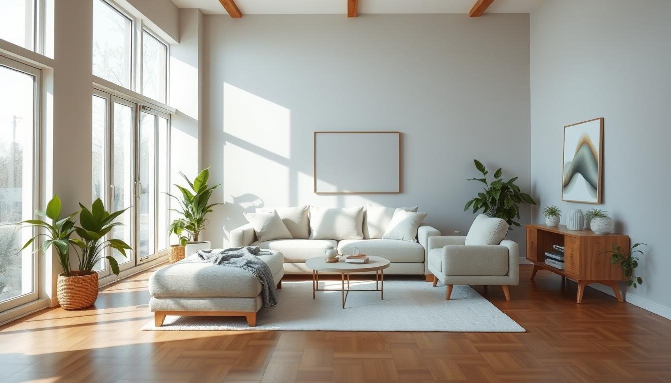
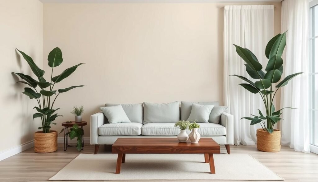
Standing in my living room, the sun’s warm rays fill the space. The neutral colors for minimalist spaces I chose create a calm atmosphere. This lets the natural textures and clean lines shine.
Choosing the right neutral colors can change a space. It can go from cluttered to peaceful and balanced.
In this guide, we’ll learn how to pick the best neutral colors for minimalist decor. We’ll cover the psychology of neutrals and how room orientation and natural light matter. You’ll get the skills to make a space that’s both beautiful and reflects your style.
Understanding the Fundamentals of Minimalist Color Theory
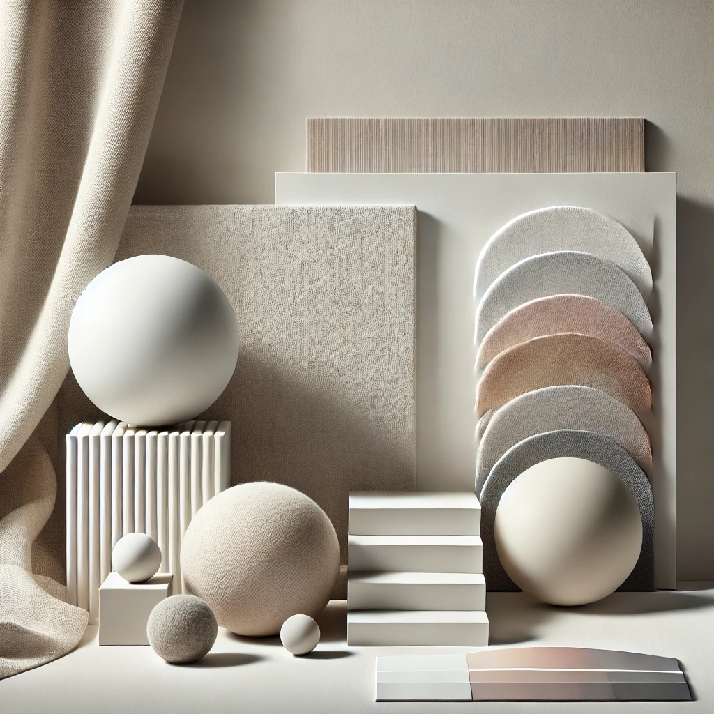
Neutral colors are key in minimalist design, making spaces calm and clean. They are based on color theory, helping us pick the right colors for our decor.
The Psychology of Neutral Colors
Colors like white, gray, beige, and taupe bring peace and simplicity. They calm us, making us feel relaxed and balanced. Using these colors, we create a calm and sophisticated space.
How Light Affects Color Perception
Light changes how we see neutral colors. Natural and artificial light can make colors look different. Knowing this helps us pick the best colors for our spaces.
The Role of Space and Scale
The size of a room affects the best color choice. Lighter neutrals make small spaces feel bigger. Darker neutrals warm up large rooms. Choosing the right color depends on the room’s size.
Color Scheme
Monochromatic: Variations of a single color creating unity and simplicity
Analogous: Colors next to each other on the color wheel for cohesion
Complementary: Opposite colors on the color wheel create high contrast and vibrancy
“Minimalism is not a lack of something. It’s simply the perfect amount of something.” – Nicholas Burroughs
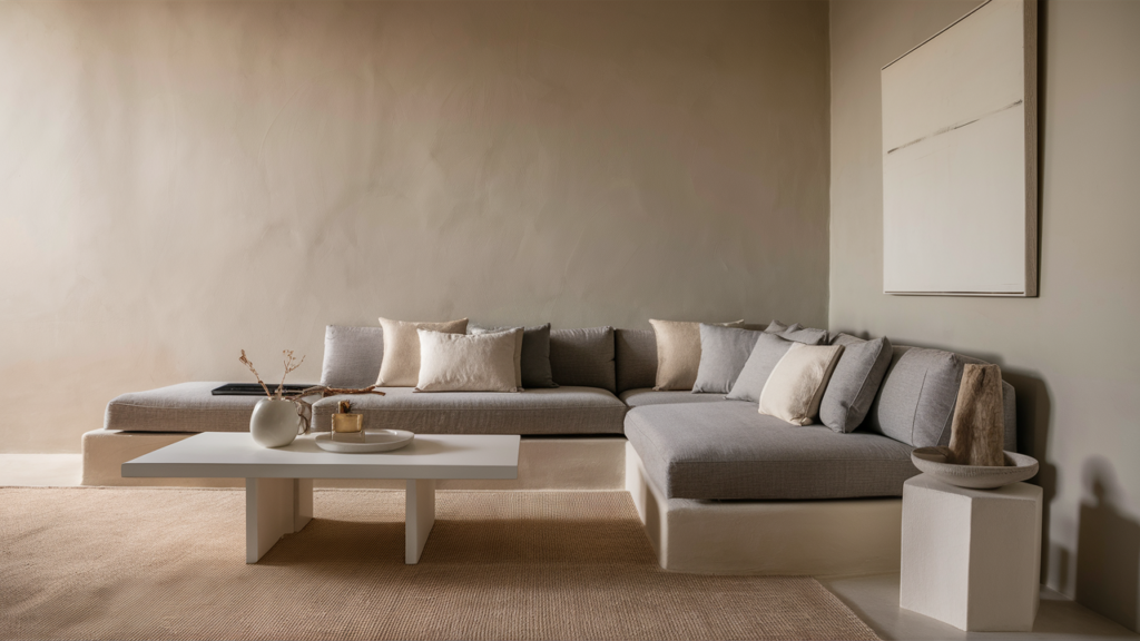
Best Neutral Colors for Minimalist Spaces
Choosing the right neutral colors is key to creating a clutter-free living space. Muted tones and monochromatic palettes help keep the focus on clean lines and natural materials. This is what Scandinavian minimalism is all about.
Shades of white, beige, gray, and taupe are top choices for minimalist spaces. White brings a timeless feel, while beige adds warmth. Gray is sophisticated and versatile, and taupe grounds the space.
These colors can be mixed and matched to add depth and interest. Yet, they keep the space uncluttered. Our research shows that 33% of minimalist spaces use gray and white, and 16.6% use beige and white.
- Percentage of minimalist color palettes that include black and white: 33%
- Percentage of minimalist color palettes that include gray and white: 33%
- Percentage of minimalist color palettes that include beige and white: 16.6%
- Percentage of minimalist color palettes that include black, white, and wood: 16.6%
- Percentage of minimalist color palettes that include blue and white: 16.6%
Interior designers at Satin and Slate suggest using nuanced whites. Oatmeal tones, for example, are a warm middle ground. They add depth without overwhelming the space.
“Neutral colors like beige, cream, and tranquil gray are recommended by color experts for creating a clean, uncluttered look that emphasizes simplicity in minimalist spaces. Incorporating pops of calming greens can add depth and warmth without disrupting the serene aesthetic.”
By choosing and layering these timeless colors, you can create minimalist spaces that are calm and sophisticated. These are the hallmarks of a serene home aesthetic.
ALSO READ: How to Pick the Best Colors for Your Space

The Power of White in Minimalist Design
In the world of home decor, white is key to minimalist design. It brings clarity and beauty, making spaces calm and simple. White can change a room, making it feel open and free from clutter.
Warm Whites vs. Cool Whites
Choosing between warm and cool whites changes a room’s feel. Warm whites, like Benjamin Moore’s White Heron OC-57 or Chantilly Lace OC-65, make spaces cozy. Cool whites, such as White Dove OC-17, give a modern, crisp look.
Popular White Paint Selections
For the perfect white paint, people often pick Benjamin Moore. Their Off White Collection has many shades. From soft Revere Pewter HC-172 to bright Simply White OC-117, which was a Color of the Year.
Creating Depth with Different White Tones
Designing in white isn’t just about picking a color. Mixing different whites and textures adds depth. This makes the space interesting and blends Scandinavian style with modern touches.

“The beauty of white is its ability to transform a space, evoking a sense of calm and serenity that is so essential in today’s fast-paced world.”
Working with Sophisticated Grays
Creating a calming space is easier with sophisticated grays. This timeless neutral is perfect for minimalist design. It offers a versatile canvas for a monochromatic palette that looks elegant. Gray shades range from light and airy to dark and cozy, fitting different rooms and lighting.
Cooler grays, like Little Greene’s Shallows or Farrow & Ball’s Ammonite, are great for south-facing spaces. They match the cool tones of natural light. On the other hand, red-, brown-, or yellow-based grays, such as Crown Paints’ Matted Off, warm up northern and eastern light. This creates a cozy and inviting atmosphere.
| Gray Paint Color | Undertone | Lighting Compatibility |
|---|---|---|
| Little Greene’s Shallows | Cool | South-facing spaces |
| Farrow & Ball’s Ammonite | Cool | South-facing spaces |
| Crown Paints’ Matted Off | Warm | Northern and eastern light |
Designers use gray’s versatility to create sophisticated, serene spaces. By choosing the right gray tones, homeowners can turn their living spaces into calming oases. These spaces exude understated elegance and a clutter-free ambiance.

Beige and Taupe: The Warm Neutrals
In minimalist design, beige and taupe are key for a calm home. Beige brings coziness to north-facing rooms, making them feel welcoming. Taupe, between gray and brown, adds elegance and balance to spaces.
Selecting the Right Undertones
Choosing the right undertones is crucial for beige and taupe. The LRV range for most homes is 60-70. Knowing the undertones, like pink beige or gold beige, helps your colors fit perfectly with your decor.
Combining Warm Neutrals with Other Elements
To make a space feel inviting, mix warm neutrals with natural materials. Wood, jute, and linen add depth and interest. Layering different tones and textures creates a beautiful, harmonious design.
| Warm Neutral Color | LRV Range | Undertone | Design Application |
|---|---|---|---|
| Sherwin-Williams Kilim Beige 6106 | 60-70 | Warm, leaning towards orange | Ideal for creating a cozy, inviting atmosphere in north-facing rooms |
| Sherwin-Williams Nomadic Desert 6107 | 50 | Medium-depth with a subtle gray undertone | Suitable for accent walls when paired with lighter beiges |
| Sherwin-Williams Latte 6108 | 38 | Warm, with a medium-depth tone | Versatile choice for walls, cabinets, or furnishings |
| Sherwin-Williams Accessible Beige 7036 | 65 | Soft gray undertone, the most neutral beige | Highly versatile for a range of minimalist design styles |

Beige and taupe bring warmth and comfort to your home. They fit well with scandinavian design’s clean lines and monochromatic spaces. By choosing the right undertones and mixing with natural materials, you create a space that’s both stylish and cozy.
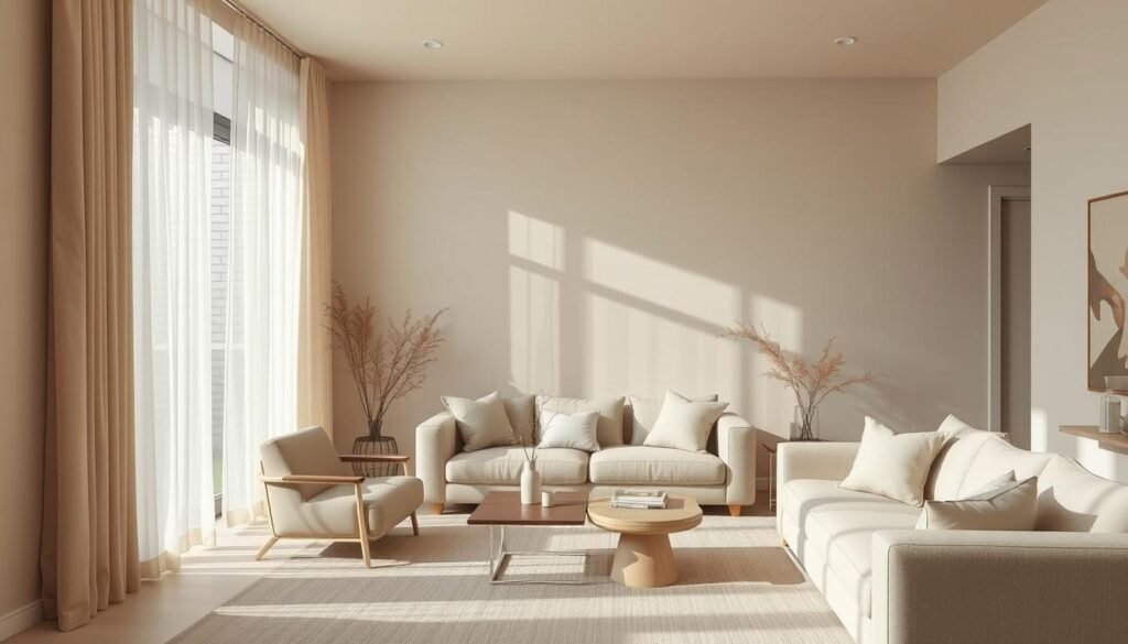
Room Orientation and Natural Light Considerations
Choosing the right neutral colors for your minimalist space is important. The room’s orientation and natural light play a big role. The way sunlight hits a room changes how colors look, so it’s key to get it right for a calm, tonal minimalist feel.
North-facing rooms get cooler, bluer light. They look best with warmer neutrals like earthy hues and soft beiges. This helps balance the cool feel. South-facing rooms, with their bright light, are perfect for cooler scandinavian aesthetic colors like crisp whites and subtle grays.
East- and west-facing rooms have light that changes all day. So, it’s smart to pick calming color palettes that work in both morning and afternoon light. Neutral colors with a hint of green or yellow keep these spaces feeling natural and cohesive, even as the light changes.
Think about when you’ll use the room most when picking colors. Colors that complement the natural light create a peaceful, minimalist vibe that refreshes you.
“North-facing rooms are often considered challenging when decorating with neutral paint. The light in north-facing rooms is described as the coolest, casting a blue hue, making cool colors feel flat.”

Creating Depth Through Layered Neutrals
In the world of minimalist design, layered neutrals are key. They add depth and visual interest. By mixing warm and cool tones, we create zen-inspired interiors that feel calm and modern décor at the same time. This approach turns open-concept living spaces into peaceful sanctuaries.
Monochromatic Color Schemes
Monochromatic color schemes help build depth. Using different shades of the same color, like warm beiges or cool grays, creates a sophisticated look. It’s important to mix tones, textures, and materials to avoid a flat feel.
Texture and Material Selection
Adding natural textures and materials is crucial for interest in a neutral palette. Pair the smoothness of modern décor with the warmth of wood, the softness of linen, or the beauty of stone. This mix of textures and materials adds depth and prevents a sterile feel.
| Material | Contribution to Neutral Spaces |
|---|---|
| Wood | Adds warmth and natural charm |
| Stone | Provides a sense of ruggedness and timelessness |
| Linen | Introduces a soft, relaxed texture |
| Velvet | Brings a touch of luxury and sophistication |
By carefully layering these neutral elements, we create clean aesthetics and zen-inspired interiors. These spaces are both visually stunning and calming. They capture the essence of scandinavian style, blending form, function, and tranquility.

Incorporating Natural Materials and Textures
Creating a calm and welcoming minimalist space is all about natural materials and textures. Wood, stone, linen, and jute add beauty to a simple color scheme. This mix makes your space both beautiful and peaceful.
Wood and stone bring warmth and depth to your home. They connect the inside with the outside. Furniture and decor made from these materials show off their unique looks, adding interest without clutter.
Use textured fabrics like linen and jute for depth and coziness.
Bring in organic elegance with woven baskets, macrame, or natural fiber rugs.
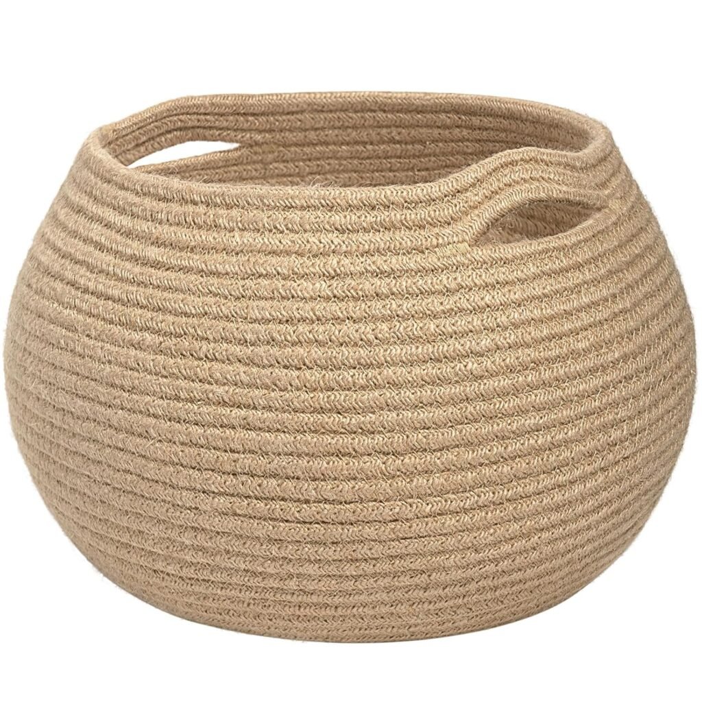
Woven Basket
Soft and foldable jute rope basket with a unique spherical design, ideal for storage or as a stylish plant holder. Neutral tones complement any décor while handles ensure easy mobility. Perfect for bedrooms, kids’ rooms, or living spaces. Machine washable for convenient cleaning and maintenance.
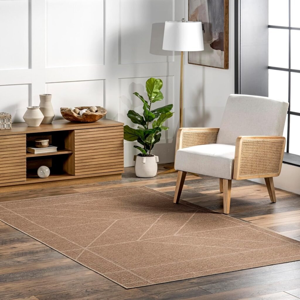
Natural Fiber Rugs
100% seagrass rug with a casual style, perfect for entryways, living rooms, or dining rooms. Its sleek 0.2” pile height fits easily under furniture and doorways, while a non-skid backing keeps it in place. Durable and easy to maintain with regular vacuuming and spot cleaning.
Match neutral colors with wood and stone’s earthy tones for balance and harmony.
Using natural materials and textures makes your minimalist space special. It connects your home with nature. This blend of simplicity and nature creates a calm and welcoming place.

“The key to creating a truly captivating minimalist space lies in the intentional use of natural materials and textures. They add depth, warmth, and a sense of authenticity that cannot be replicated by synthetic alternatives.”
| Natural Material | Characteristics | Ideal for Minimalist Spaces |
|---|---|---|
| Wood | Warm tones, unique grains, and a tactile quality | Furniture, shelving, and accent pieces |
| Stone | Earthy tones, natural variations, and a sturdy presence | Countertops, flooring, and decorative elements |
| Linen | Soft, textured, and breathable | Curtains, bedding, and upholstery |
| Jute | Durable, coarse, and eco-friendly | Area rugs, baskets, and decorative accents |
Common Mistakes to Avoid When Choosing Neutral Colors
Creating a calm, muted shades-based modern minimalism is a fine art. Steer clear of common errors when picking neutral colors. This way, you can achieve the monochromatic color schemes and simple color combinations that are key to minimalist spaces.
One error is ignoring undertones. Warm beiges with yellow or red undertones can look unhealthy in rooms with lots of strong light. On the other hand, cooler grays with blue or green undertones might seem too harsh in dim areas. Always check paint samples at different times to make sure the color works well with your room’s natural light.
Another mistake is choosing true whites, which can feel too clinical in rooms with little sunlight. Instead, go for soft, muted shades that bring a tranquil atmosphere without being too sterile. Mixing different white tones can also add depth and interest.
Lastly, avoid making your space too one-dimensional. While a monochromatic color scheme is essential for modern minimalism, adding texture, natural materials, and accent colors can keep your design lively.
“In minimalist spaces, using too many colors can make a room look cluttered and busy.”
By sidestepping these common mistakes, you can create a modern minimalist retreat. It will feature muted shades, simple color combinations, and a perfect mix of light and texture.

Conclusion
Choosing the right neutral colors can turn your home into a peaceful, zen-inspired space. Learning about color theory and the psychology of neutral tones helps. This way, you can create a scandinavian design aesthetics that brings calm and happiness.
Looking into whites, grays, and warm neutrals like beige and taupe is key. Think about natural light and room layout to add depth and elegance. Adding natural materials and textures makes your serene living spaces even better.
Mastering neutral home design is all about trying new things and seeing how colors work together in your space. Stay away from common mistakes and use layered neutrals. This way, you’ll create a timeless, zen-inspired home that shows off your style and brings peace.